My Bathroom Makeover: Part One // The Vision
I’ve been joking lately that this is the “bathroom remodel no one asked for.” Honestly, I probably could have patched the grout, replaced the broken shades, and called it a day. But in a 1923 Portland centennial home with just one bathroom on the main floor, “fine” doesn’t quite cut it—especially when that room doubles as our primary bath, guest bath, and office bathroom since I both work from home.
With plans to stay in this house for at least the next decade while my mother-in-law is with us, I realized that “easy to work with” wasn’t the same as “easy to live with” every day. I was tired of fighting with high-maintenance surfaces that just didn't suit our lifestyle.
I wanted a space that was two things: easier to maintain and a true reflection of our personality.
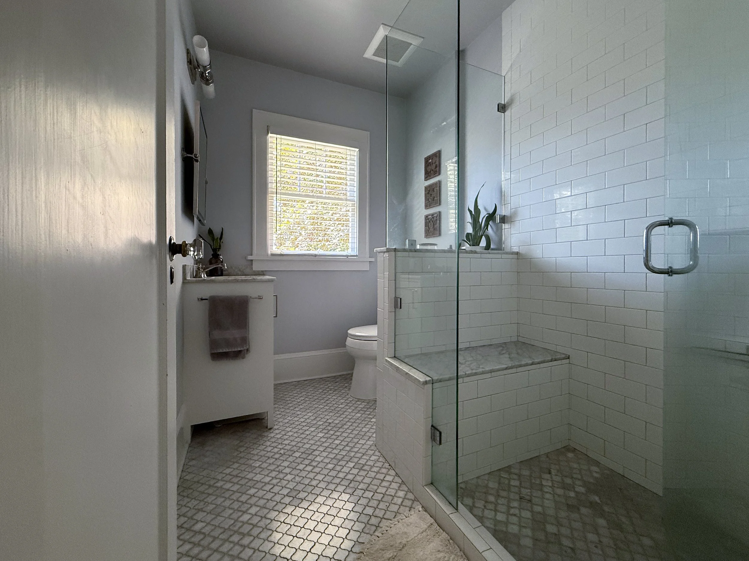
If you saw the real estate listing (and even the photos in this post), you’d think the bathroom was finished. But living in a space is very different from looking at it. Despite the marble and white tile, the functionality was failing us. So, we’re moving past the "good enough" and diving into a redesign that prioritizes function without sacrificing soul.
Here’s what wasn’t working, along with the things we were grateful to start with. Then I can get into the improvements ahead.
First, I’d like to say that the previous owners — who we know — did a really lovely job updating this bathroom. A lot of what’s here isn’t wrong — it just isn’t how we live.
The Pain Points
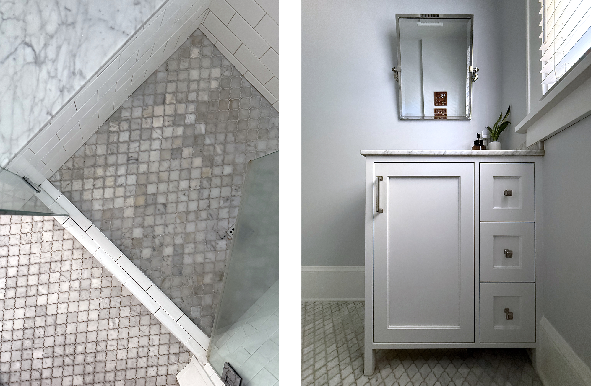
Floor: Way too much grout for a high-traffic Portland home.
Dust-Magnets: Traditional cabinet trim that requires constant scrubbing.
Marble Surfaces: Too porous for our "easy-maintenance" goals.
"Safe" Style: Builder-grade choices that didn’t reflect our personality.
The Wins
Layout: The plumbing is in the right place, which is a huge win for the budget.
Natural Light: That big window (once replaced) is the best feature of the room.
Added Storage: There is a narrow cabinet tucked behind the pony wall.
Hardworking Size: It’s small, but it’s proven it can handle a lot of traffic.
The Vision: Functional, Modern, and "Us"
Now that we’ve identified the pain points, it’s time to talk about the curation.
While the existing bathroom was bright and clean, it often felt more cold than calming. The white tile, cool tones, and hard surfaces gave it a slightly clinical feel — especially in a small space we use every day.
This redesign is about warming things up through natural materials, softer finishes, and thoughtful details that make the room feel more inviting without sacrificing function. I’m also incorporating a blend of modern and traditional elements, a balance I naturally gravitate toward in my designs.
Materials & Finishes
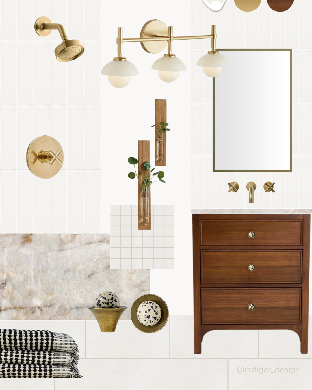
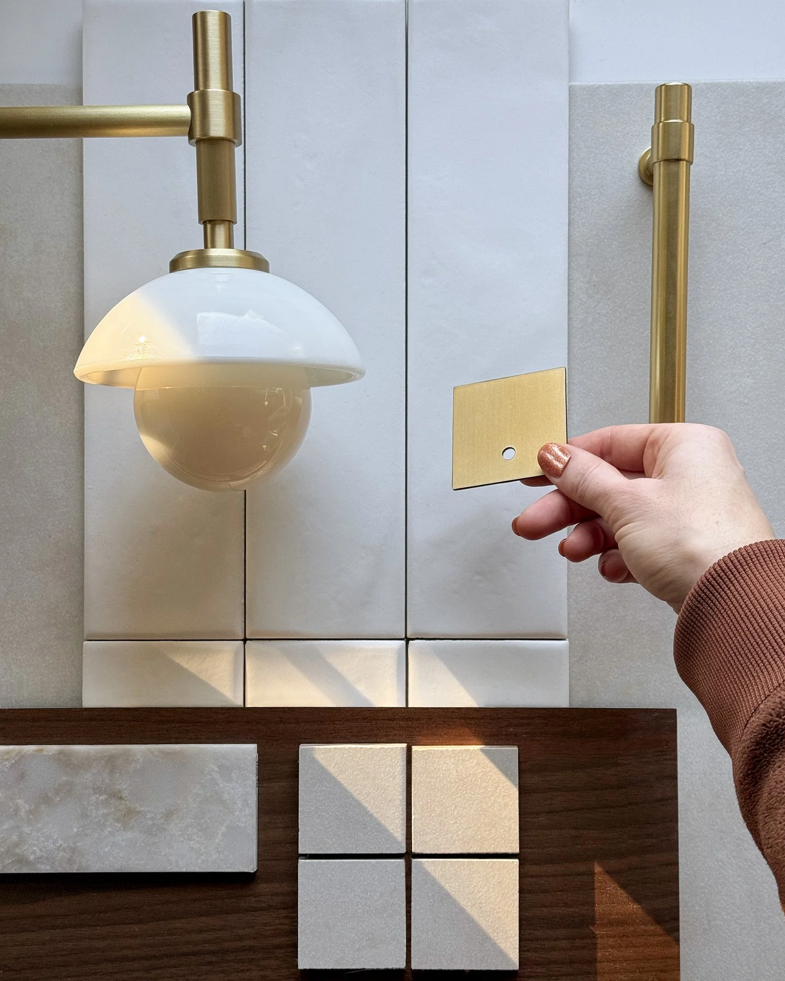
If you’ve seen any of my other spaces, you know I have an affinity for brass. I love the warm glow it brings to a room, so it felt important for the bathroom — which previously leaned brushed nickel — to fall in line with the rest of the house.
I considered carrying the same terracotta hex tile from the kitchen into this space, but ultimately decided that bigger was better. I opted for Bedrosian’s Loft 12" × 24" honed porcelain tile in white to reduce grout maintenance and help the space feel larger and less visually busy (which also means easier cleaning — always a win).
The shower pan will use the same material in a smaller 2" × 2" mosaic to accommodate the curve of the base, while the walls will be finished in the New Yorker 3" × 12" matte white ceramic tile by Settecento, installed in a vertical stacked pattern. This layout allows water to run down the channels more easily, helping to minimize grout buildup over time.
To balance all of the stone and tile, we chose Rejuvenation’s Wallace 27" Powder Vanity in walnut to bring in natural texture and depth. The richness of the wood softens the harder surfaces in the room and helps shift the overall feeling from cool and clinical to warm and inviting.
It also adds a sense of craftsmanship and character — something that feels more in line with the age of our home and the way we want the space to feel long-term.
For the countertop, I initially explored quartz but couldn’t find an option that felt personal enough. I wanted movement and depth in the material — and while I do appreciate quartz, it lacks the character and variation that natural stone brings.
A visit to Bedrosians led me to a full slab of Bordeaux Polished Crystalllo quartzite — stunning, but far more than this small bathroom required. After calling around to local fabricators, I found a Miro Fantasy quartzite remnant with a similar feel, and that was the moment everything clicked. It felt like the right time to commit to the next steps of sourcing lighting and fixtures.
Lighting & Fixtures
Lighting and hardware play a bigger role in how a space feels than we often realize — especially in a room that previously leaned cool and bright.
As I mentioned earlier, I’m a brass lover. But not all brasses are created equal in my eyes. In the kitchen, we have unlacquered brass that develops a natural patina over time, adding warmth and character. For the bathroom, I wanted a brass finish that offered that same richness and depth, but without showing as much visible wear over time.
Bathrooms, to me, should feel clean and fresh — not like they’re developing “character” in the form of water marks, rust, or anything that could read as unintentional.
For this space, I sourced my vanity light, shower, and sink fixtures from Rejuvenation in a aged brass finish, then paired them with a slightly darker aged brass medicine cabinet frame from Robern. Smaller details — like the shower glass clamps, door stop, and toilet handle — were sourced elsewhere, but I was able to find finishes that felt cohesive.
Because these pieces came from different places, I embraced the idea that not every brass tone needed to match perfectly — and that’s okay. As long as the finishes stay within the same family (aged or antique rather than polished or brushed), mixing metals can feel intentional. Most of the hardware is never visible at the same time, so subtle variations add depth rather than distraction.
The goal was to select fixtures that feel refined but not fussy — pieces with warmth, character, and a subtle vintage sensibility with a modern flair. Soft globe lighting, warm metal finishes, and simple, timeless forms help balance the clean lines of the tile and keep the space from feeling too stark.
Added Upgrades
Beyond material and fixtures changes, I’m incorporating a few quality-of-life upgrades: heated floors, a warm walnut vanity, a recessed medicine cabinet with built-in electrical, and a wall-mounted faucet. These aren’t just aesthetic choices — they’re thoughtful additions that make the space more functional, comfortable, and aligned with how we actually live.
What’s Next
The vision is set, the materials are sourced, and the Miro Fantasy quartzite is waiting at the fabricator. Next up, we say goodbye to the lantern tile and hello to the dusty reality of renovation.
Stay tuned for Part Two: The Process.