My Kitchen Remodel: Where Rediger Design Began
This kitchen remodel was one of the earliest projects that shaped how I approach residential design. Located in my century-old Portland home, it wasn’t about chasing a trend or creating a showpiece — it was about understanding what actually matters when you live in a space every day.
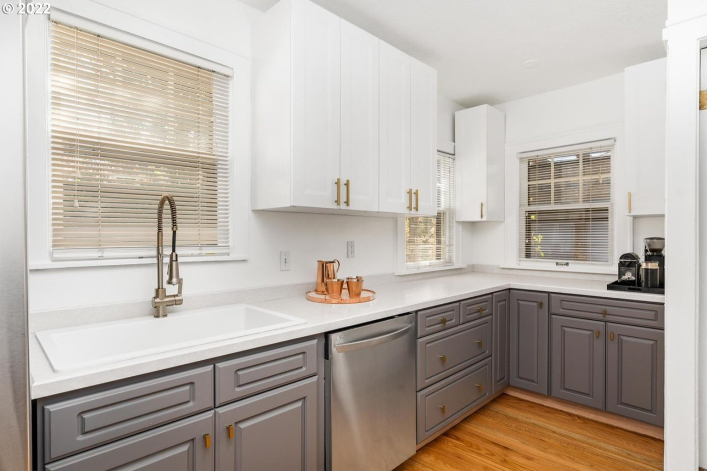
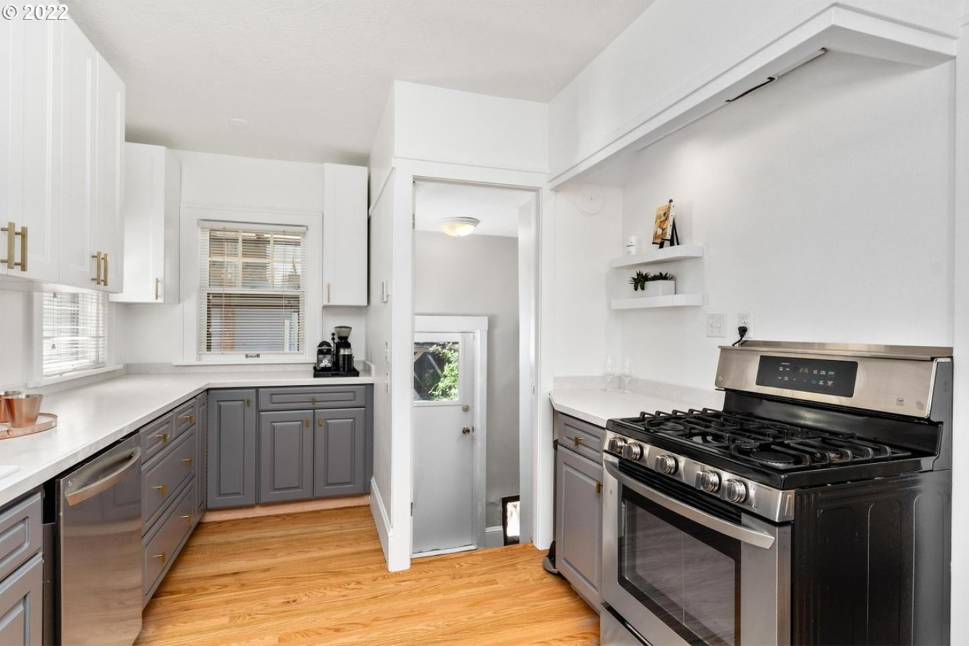
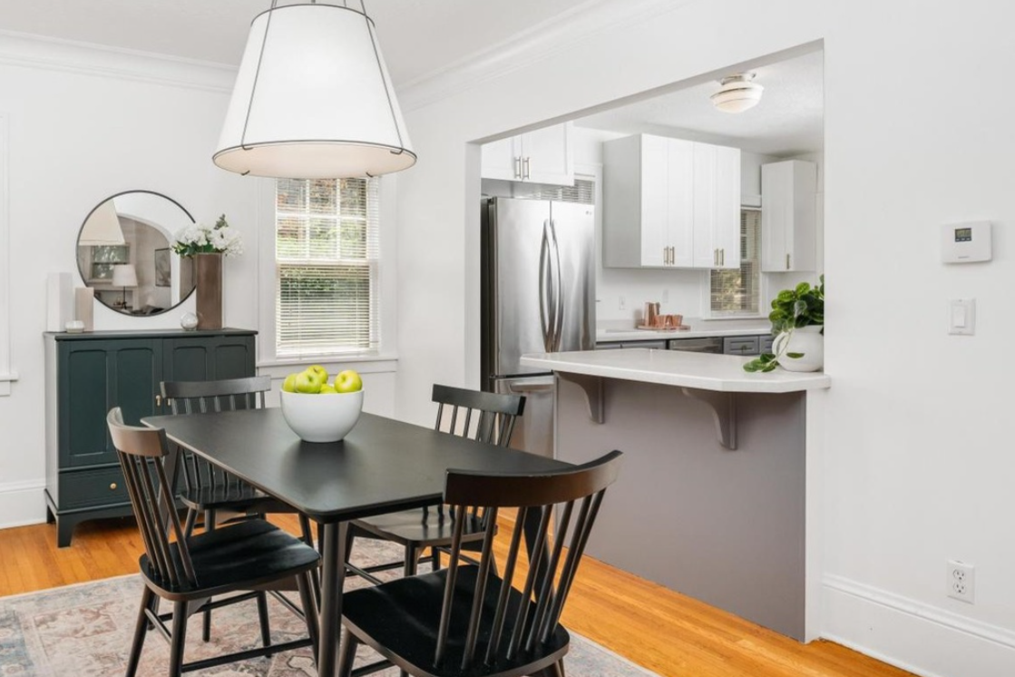
From the outside, the original kitchen looked perfectly serviceable. But living in it revealed a different story.
Over time, small frustrations added up: peeling countertops, water pooling around the sink, storage that existed but never worked the way we needed it to. Deep cabinets where drawers would have made more sense. A layout shaped by decades of small, well-intentioned fixes rather than a cohesive plan.
This wasn’t a kitchen that failed outright — it was functional on the surface, but inefficient in daily use. Before thinking about finishes or style, we knew the fundamentals needed attention.
The layout had to change.
Updating the Layout
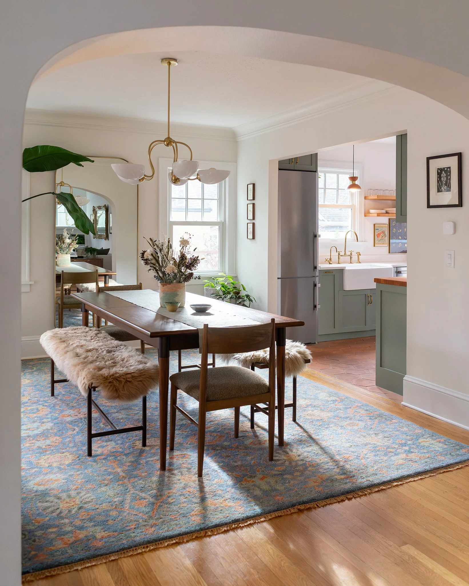
The kitchen itself was a decent size for two people, but three separate entry points — along with several awkwardly placed features — dictated how the room could function. Movement through the space determined where cabinetry, appliances, and work surfaces could go, often working against us rather than with us.
Before jumping to solutions, we mapped the existing layout and identified the constraints that most affected daily use. These became our non-negotiables:
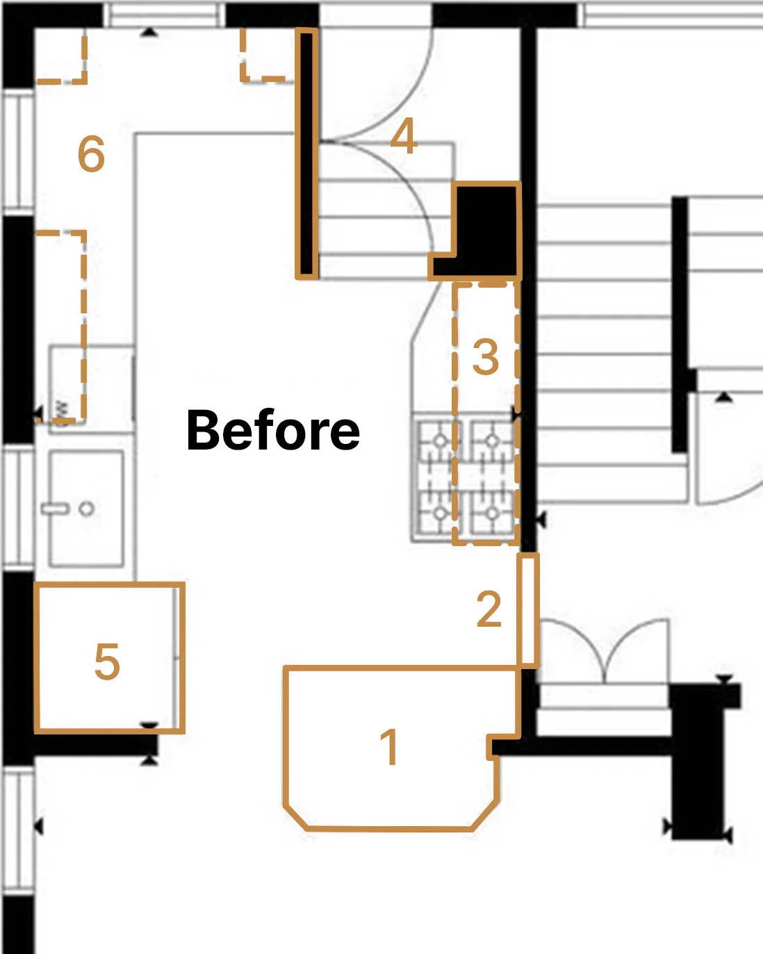
Removing the peninsula between the kitchen and dining room
It offered limited prep space but sat too close to the dining table to be useful and blocked the walkway whenever the refrigerator was open.Closing the hallway to the bathroom and downstairs bedroom
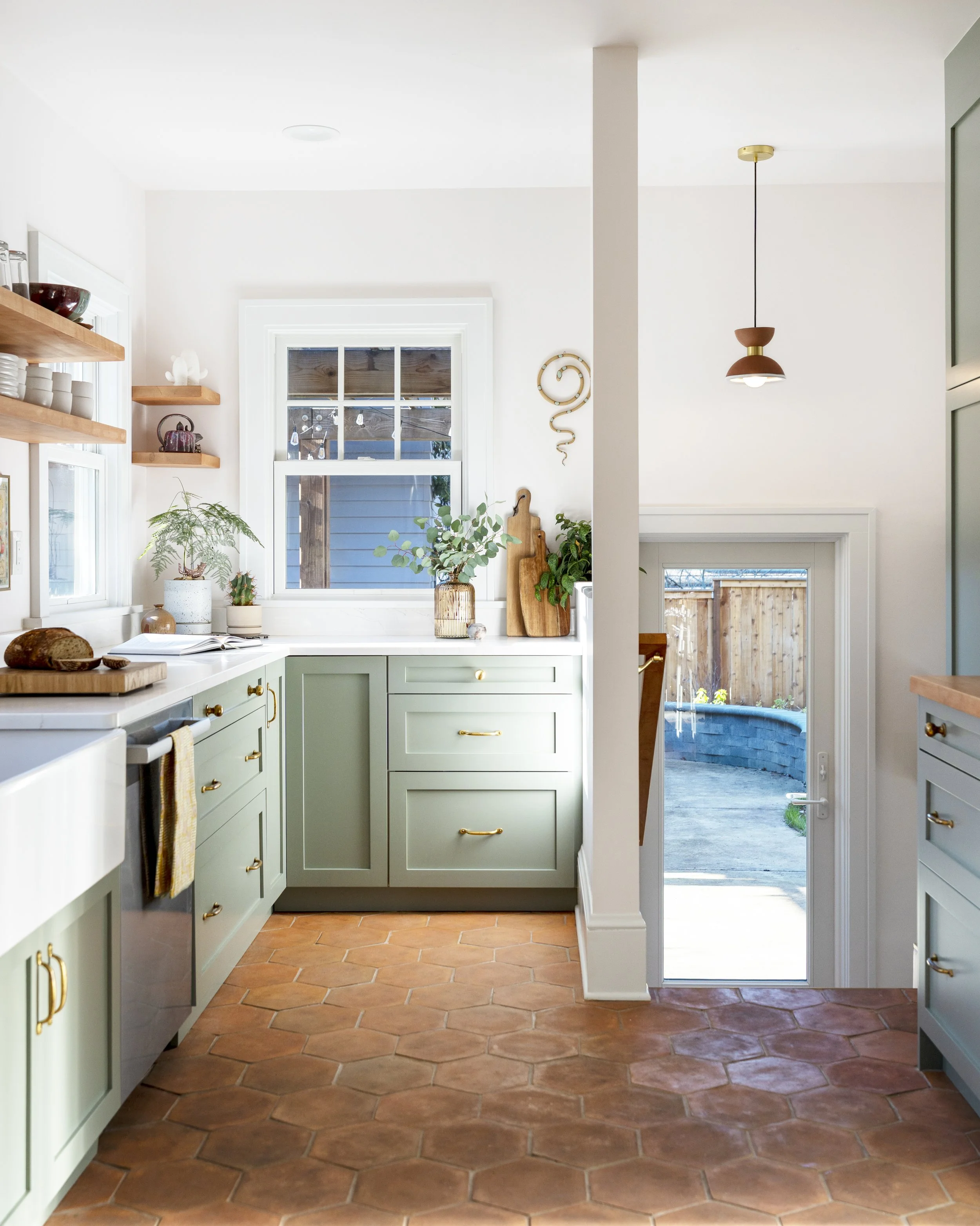
While it technically provided access, it eliminated valuable counter space beside the stove — exactly where it’s most needed when cooking.Replacing an undersized drop-ceiling hood and removing an unused chimney
The hood lacked the power needed for a gas range, and the hidden chimney took up space without serving a purpose.Removing a door that opened directly onto stairs
Doors should open onto a landing for safety. This one didn’t — and it also created a dark vestibule that disrupted flow to the back door and laundry.Swapping an oversized refrigerator for a slimmer, taller model
The old fridge protruded into an already narrow walkway and eliminated usable counter space near the sink.Reworking upper cabinet placement
Previous attempts at adding storage felt visually heavy and made the main prep area feel crowded.
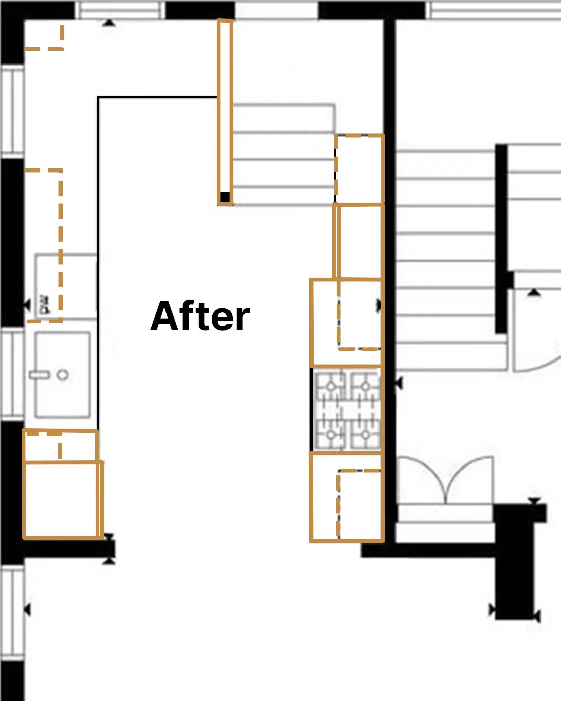
A New, Improved Layout
Together, these changes allowed us to rework the kitchen around function and daily use.
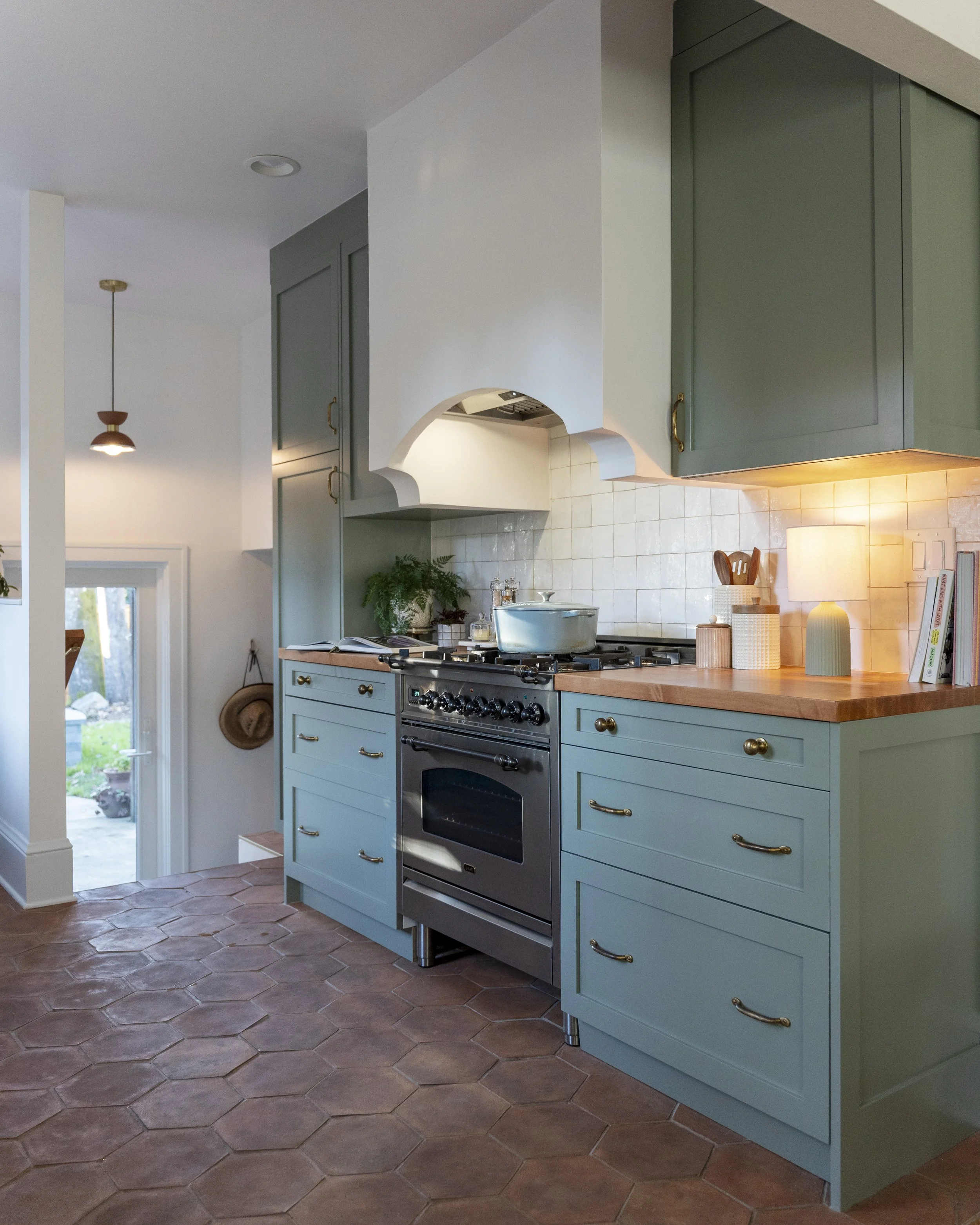
Closing the hallway freed up continuous counter space on both sides of the stove, improved privacy for the downstairs bedroom, and helped contain kitchen noise and smells. Updating the hood and removing the chimney allowed us to fully rework the range wall and add a full-height pantry near the stairs.
Removing the peninsula opened a clear path from the front door through the dining room, into the kitchen, and out to the backyard. The kitchen stopped feeling like a bottleneck and became part of the natural flow of the house.
Choosing a slimmer refrigerator improved both storage and usability, giving us additional counter space and allowing for organized pull-out storage rather than clutter under the sink. Keeping the left wall free of upper cabinets helped the room feel more open and balanced, with floating shelves maintaining sightlines without sacrificing function.
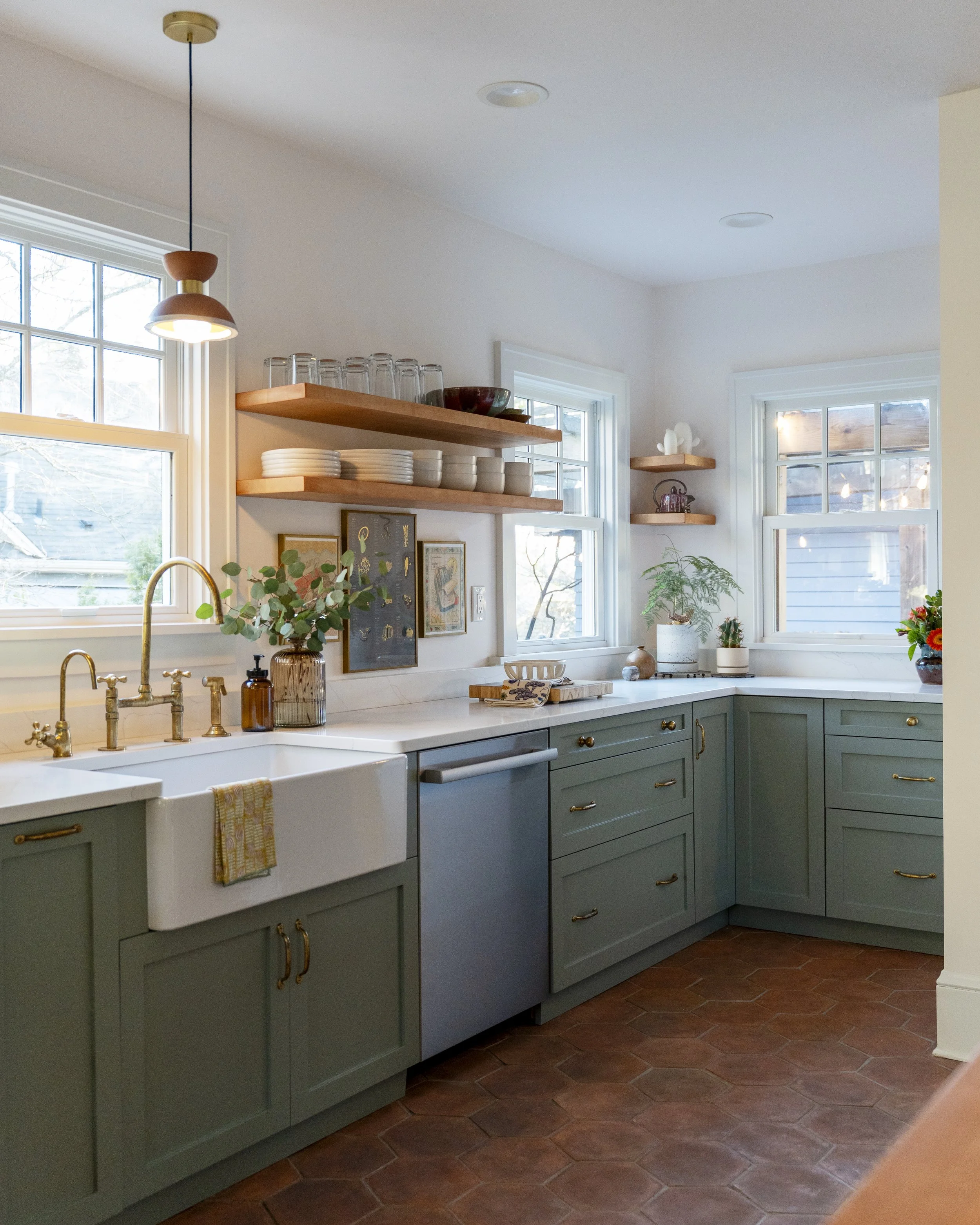
Cabinetry & Storage
With the layout resolved, cabinetry became the backbone of how the kitchen functions day to day. The goal wasn’t maximum storage — it was better storage.
In the original kitchen, deep cabinets and undersized drawers made everyday tasks harder than they needed to be. This remodel allowed us to rethink where things lived and how often they were accessed.
We used IKEA’s SEKTION cabinet boxes paired with MAXIMERA drawers and UTRUSTA hardware (manufactured by Blum) for a durable, well-engineered foundation. At the time, I used IKEA’s kitchen planner to develop the layout — an approachable tool I still recommend to homeowners who want to explore layouts without professional software.
While the cabinet system provided structure, the exterior is where we brought in character. We worked with AllStyle Retrofitto create custom cabinet fronts painted in Portola Paints’ Fountain Stone, giving the kitchen a cohesive, tailored look without sacrificing flexibility.
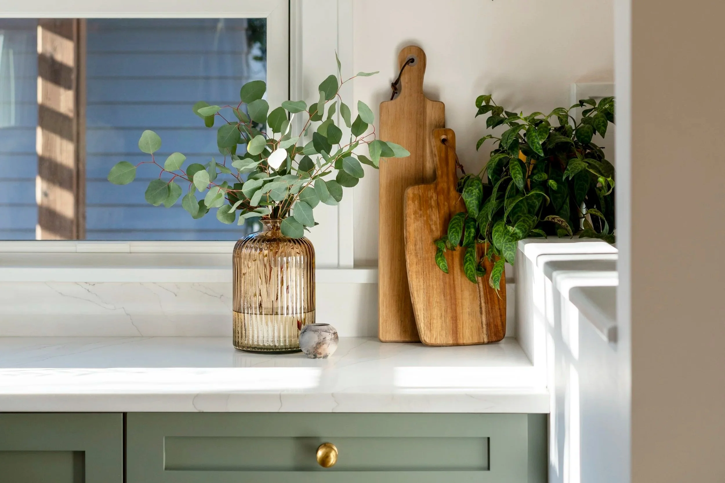
Despite removing upper cabinets along one wall, the finished kitchen has more usable storage than before. Drawers replaced deep base cabinets, a full-height pantry handles bulk storage, and open shelving holds the dishes we use every day.
Because we work from home and cook most meals here, dust hasn’t been an issue — everything on the shelves is in constant rotation. With the dishwasher, silverware, and food storage aligned vertically, unloading and meal prep feel intuitive and efficient. Open shelving isn’t for everyone, but for this household, it supports how we actually live.
Materials & Finishes
We brought in Julia of Little by Little to help refine materials and finishes — my first experience collaborating with another interior designer in this way. Having an outside perspective helped us edit options, validate decisions, and move forward with confidence.
To complement the soft green cabinetry, we introduced terracotta tones and warm wood finishes to add depth without heaviness. In a space with limited natural light, this palette keeps the kitchen grounded and calm.
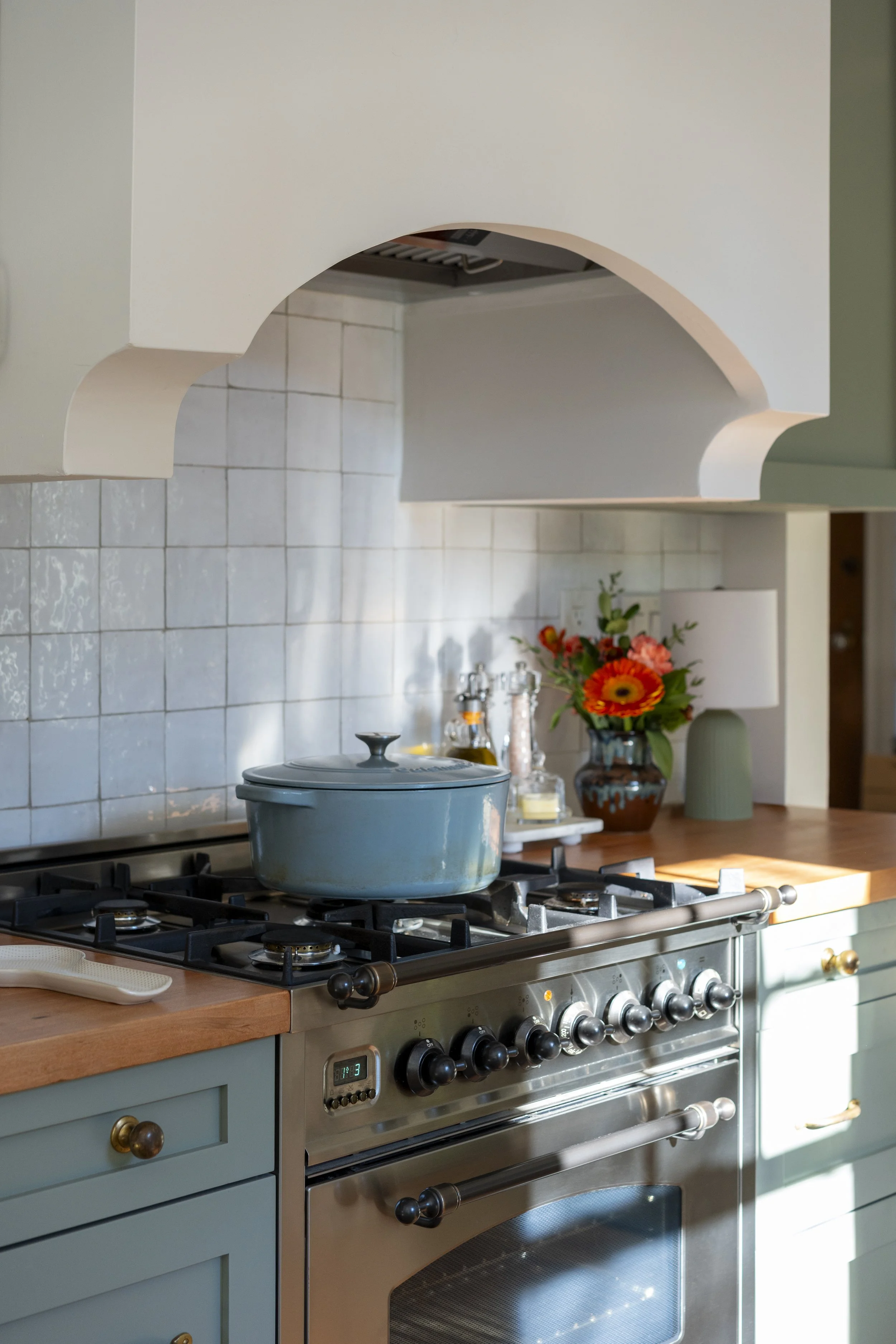
Countertops were chosen based on use: quartz along the main working counter for durability, and butcher block on either side of the range to add warmth and visually connect to the floating shelves opposite. The mix brings balance and character without overcomplicating the space.
One of our favorite materials is the terracotta flooring. Like the aged brass hardware used throughout the kitchen, it develops a natural patina over time. With pets and heavy daily use, the variation in the tile is forgiving and only adds to its charm — a floor that looks better lived in. We also loved how Julia incorporated terracotta and brass pendant lights over the sink and back door to subtly tie these materials together.
The custom range hood, built by my husband Adam, embraces that same philosophy. Slightly imperfect and handmade, it pairs naturally with the terracotta flooring and the zellige tile behind the range, reflecting the reality of a 100-year-old home where very little is perfectly square.
Simple, consistent unlacquered brass hardware ties everything together, adding warmth and continuity while keeping the kitchen resolved and livable — thoughtful, but not precious.
Final Reflections
Looking back, this kitchen marked the beginning of a more hands-on, lived-in approach to design for me — one grounded in real constraints, daily routines, and long-term use. The lessons from this remodel continue to inform how I approach spaces today, even as the projects themselves grow.
Questions About This Project
-
When small frustrations compound over time: awkward traffic flow, counter space that never seems to be where you need it, storage that exists but doesn't work. Those are signals the layout is the real problem. Finishes can refresh a kitchen, but they can't fix a workflow that works against how you actually move through the space. Solving the layout first means every finish decision lands in a room that already functions.
-
It depends entirely on how the household uses the kitchen. Open shelving works well when the items on display are in constant daily rotation — dishes, glasses, things that get touched every day. Where it fails is when it holds things that rarely get used and collect dust. The honest answer is that it requires more intention than closed cabinets, but for the right household it can be both practical and more accessible than deep closed storage.
-
Mixing countertop materials can add character and solve practical problems at the same time. Quartz works well on main working surfaces where durability matters most. Butcher block adds warmth near a range or in a secondary zone and visually connects to wood elements elsewhere in the room. The key is having a reason for the mix — surface type matched to how each area is actually used — rather than mixing for its own sake.
-
Unlacquered brass is a natural fit for kitchens with warm palettes — terracotta, soft greens, wood tones. It develops a natural patina over time, which adds character rather than showing wear. It reads as warm and consistent without feeling matchy, and it ties together materials that might otherwise feel unrelated.